This is the second installment about turning a friend into a magazine cover. (If you missed Part 1 you can see it HERE.)
Once you’ve removed any unwanted image area and saved the result as a .png image for use in your design you might consider creating a template image for convenience.
I keep a Templates folder in My Documents where I keep templates for various types of projects. The one I use most often used is labeled “MakeCard”. Clicking on it opens the file in Paint.Net, set to the correct pixel size for a PicturePlus card with several layers already created for background, added image, margin/safe print area & text. It’s handy.
You’re welcome to use mine. You can get a copy of it HERE.
The advantage here is that your finished work will fit perfectly on your card when you upload it, so there’s no particular fussing or back-tracking at the card-sending stage. ( As a note, any of the layers you create here can be saved separately as .png images and kept online in a folder on your SOC image gallery, in case you want to re-use your cover art & add photos in your card editor on-the-fly.)
Here’s what my template looks like: I’ve set the image size as 1630×2250 (5.38×7.5 inches) and a resolution of 300 pixels per inch. You can set it higher if your system has a good amount of memory.
(Depending on the browser type you use clicking directly on the image should enlarge it enough for you to see detail)
")
I replaced the background layer with whatever works for the project at hand. In this case I’m going to use a gradient of dark grey so you can see the next images better.

At this point we can leave the face image here in the right general area with an estimated amount of logo area free above it and turn our attention to what an actual “WIRED” mag looks like. So I’ll do a fast Google Image search and grab several good examples. “png logo wired” is one search and “cover wired magazine” is the other.
Let’s take 3 sample covers showing the variations in design.

Pretty cool. We can put the head in front or behind the logo, add text pretty much anywhere it works.
I found several logos and chose one that came up sharp and in black and white because we can make this any color we want to fit the design.
I just right-click on the logo image, select open with Paint.Net, click on Edit/Select All/Copy and go back to the template and do Edit/Paste in to new layer. Named the layer Logo Black and White (we’ll end up with colored versions to test on other layers to pick the color that works best).
![]()
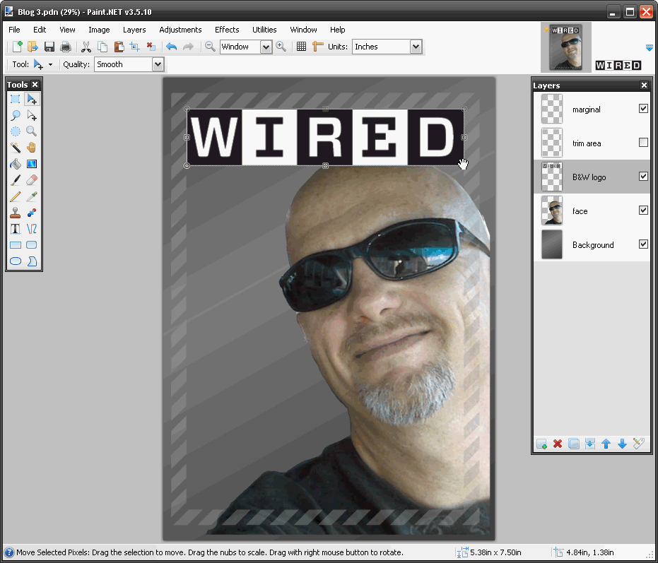
Ok. Here it is with the logo pasted into the layer.
As the logo pasted into the upper left corner it needed to be enlarged and positioned. You can select the Move tool ( filled blue arrow) and drag the image to enlarge and position the image while it is still selected.
We’ve now got 2 main parts, the image and main logo. Next step is finding a cool background that fits with a techie kind of mag, and making the logo a good color to go with it.
Next Installment: Adding Background and Text

Wow! Really cool on showing others how to create awesome Magazine Cover Cards!