Part 4 – Working with Text

Tom Rocks ColumbusThis is the 4th Part in a series about creating mock “Magazine Cover” images for your friends.     If you missed the earlier ones or want to back up they are here:   Part 1            Part 2         Part 3

I’m using a Photoshop-like program called Paint.NET to create images I can use in SendOutCards’  amazing PicturePlus card editor.    (If you’re reading this and have never used SendOutCards I highly recommend that you try it!)  If you’re using SendOutCards and are already absolutely addicted to the PicturePlus feature, then you’ll find Paint.NET to be a wonderful tool to add to your toolbelt.     (You might also want to join the Support Group for Picture Plusaholics)!

Windows has a pretty large selection of fonts and you can probably find what you need amongst the standard collection  — BUT…  If you’re an extremist I recommend trying an excellent font management tool called AMP Font Viewer.  It’s freeware, works great and has a rash of awards from people that also like great tools.      Why use it?    Fonts load up when you launch applications on your computer, so having TOO MANY installed all at once can make your system sluggish.  The AMP Font Viewer lets you easily install and uninstall fonts for special projects so you get the best of both worlds.   That way you can have 5 different flavors of “Oriental-looking” type on hand – without having a font list that’s 400 entries long!

Working with Effects Features    Paint.Net has thousands of users.   Many of them fall into the category of geeks or nerds – and they’ve created hundreds of addons you can choose from according to your uses.

Installing Effects   Paint Forum Member “BoltBait” has written a concise step-by-step guide with pictures to follow if you have any problems, so I’ll just post a link here to His Page:         How to Install Paint.NET Plugins


Thanks to everyone for your interest and enthusiasm.   Please feel free to post your comments or questions as I want to know about any details or points you’d like covered or clarified.                                                                Raoul

Adding the Background and Text

Several people  asked me to describe how to create mock Magazine Covers after I posted this image to the Facebook fanpage ” Support Group for PicturePlusaholics”

shot of Facebook image with Birthday card

This is the third installment about turning a friend into a magazine cover.     (If you missed Part 1 you can see it HERE.)  ( If you missed Part 2:  HERE.)

This is a birthday card for a friend of mine.   I decided to use WIRED magazine because he’s tech-oriented, a blogger and marketing consultant.

So we need a tech sort of background.  I want something that communicates the tech idea without being too distracting from the text I’m going to add.

A Google Image Search of “circuit board” turns up these images:

green circuit images

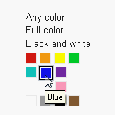
selecting search colorPretty cool but I think blue will work better than green so I filter the search (This is one of Googles COOLEST new search features – selecting the primary color of the image search) Like this:

So if you’re making someone a card and want YELLOW flowers click the yellow and Google will only display the yellow ones!  Click LARGE and Google will only show you the Large, Yellow images.       Totally cool.

Rather than show the blue Search results I’ll show the one I picked:

image of blue circuit boardI add it to the card image by right clicking on it,  selecting Open with Paint.Net, then Edit/Select All,  Edit/Copy — this puts it in clipboard memory — now as I’m going to add it above the Background layer I highlight that layer in the Layers toolbar and select Edit/Paste in New Layer.

NOTE:  Depending on the browser you’re using clicking ON these images will enlarge them enough to show detail and text.background image pasted When it pastes it drops into the upper left-hand corner.   Hardly big enough to fill the card, but we can stretch it.   That’s going to blur it a bit but this’ll be okay as  it’s just our background anyway.   (Here’s a tip:  Since we’re going to do a LOT of stretching to enlarge that circuit image enough to make it entirely FILL the background and then move it around a bit to where it looks best, you’ll find it easier to give yourself some room by using the Window magnification setting to back the view off a couple of clicks first).

enlarging the background imageI’m happy with the size and placement with this, so the next step will be to make the black and white logo  a different color.

These samples show the logo can be whatever color seems right for the month’s issue design.

sample coversSince my circuit board background is mainly Blue and I want the warm face color to stand out,   I’m going to try Violet for the logo.    Right now it is solid black and white.     I want to select all of the white and delete it.   Then I want to select all of the black and replace it with Violet.

selecting white area

Holding the Shift Key when you select part of the White area will select all of that color on the layer.   You can select multiple areas by holding the Control Key instead.  So I select all the White and press the Delete keyboard button or select Edit/Cut – your choice.    That leaves the black area we can now select and recolor to our liking.   recoloring the logo area

(As a note,  I might want to look at the logo in several different colors.  I can leave the black logo image on one layer, select its area, create a NEW layer and paste my test color into the selected area, change colors, create ANOTHER layer and paste the new color there — all while leaving the image area selected.)

That will allow you to turn on/off the visibility of the different layers to see which color works the best.

Everything is looking good

Everything looks good so far.   Now we can add text and finish it up.

My next post will cover working with text – tips on finding and using different letter fonts,  simpler techniques for sizing, arranging & positioning, etc.

Next Post:   Working with Text

Make a template the right size for a card

This is the second installment about turning a friend into a magazine cover.     (If you missed Part 1 you can see it HERE.)

Once you’ve removed any unwanted image area and saved the result as a .png  image for use in your design you might consider creating a template image for convenience.

I keep a Templates folder in My Documents where I keep templates for various types of projects.    The one I use most often used is labeled “MakeCard”.   Clicking on it opens the file in Paint.Net, set to the correct pixel size for a PicturePlus card with several layers already created for background, added image, margin/safe print area & text.       It’s handy.

You’re welcome to use mine.  You can get a copy of it HERE.

The advantage here is that your finished work will fit perfectly on your card when you upload it, so there’s no particular fussing or back-tracking at the card-sending stage.    ( As a note, any of the layers you create here can be saved separately as .png images and kept online in a folder on your SOC image gallery, in case you want to re-use your cover art & add photos in your card editor on-the-fly.)

Here’s what my template looks like:   I’ve set the image size as 1630×2250 (5.38×7.5 inches) and a resolution of 300 pixels per inch.  You can set it higher if your system has a good amount of memory.

(Depending on the browser type you use clicking directly on the image should enlarge it enough for you to see detail)

Make a template for the card

I replaced the background layer with whatever works for the project at hand.  In this case I’m going to use a gradient of dark grey so you can see the next images better.

Adding the image

At this point we can leave the face image here in the right general area with an estimated amount of logo area free above it and turn our attention to what an actual “WIRED” mag looks like.  So I’ll do a fast Google Image search and grab several good examples.   “png logo wired” is one search and “cover wired magazine” is the other.

Let’s take 3 sample covers showing the variations in design.

Sample WIRED covers

Pretty cool.  We can put the head in front or behind the logo, add text pretty much anywhere it works.

I found several logos and chose one that came up sharp and in black and white because we can make this any color we want to fit the design.

I just right-click on the logo image, select open with Paint.Net, click on Edit/Select All/Copy and go back to the template and do Edit/Paste in to new layer.  Named the layer Logo Black and White (we’ll end up with colored versions to test on other layers to pick the color that works best).

WIRED logo black and white

Ok.  Here it is with the logo pasted into the layer.

logo pasted and enlarged

As the logo pasted into the upper left corner it needed to be enlarged and positioned.   You can select the Move tool ( filled blue arrow) and drag the image to enlarge and position the image while it is still selected.

We’ve now got 2 main parts, the image and main logo.  Next step is finding a cool background that fits with a techie kind of mag, and making the logo a good color to go with it.

Next Installment:  Adding Background and Text

WALTZING to the Scrabble Beat-Down

I have a buddy in Switzerland I play Scrabble with.    He tends to win 3 out of 4 games, but I keep on trying.

Since I draw and paint as much as I play I’ve used Scrabble in a lot of cartoons.  This one came about when my he emailed me a score he’d just made on a single play.    (Fortunately, this was not one of our games).

He played 7 letters along the edge of the board, to complete the word: “WALTZING”,  scoring the 50-point bonus for playing all 7 letters and re-tripling the face value of his letters (including the 10 for Z) by landing on BOTH Triple-word score places.

Buried in a single play

So I commemorated the occasion for him with a sort of trophy-cartoon of his opponent:  Buried, in a single play.

This, by the way is a shot from The Pixie Pit where we play.

Karma Macchiato – Day 3

Day 3:

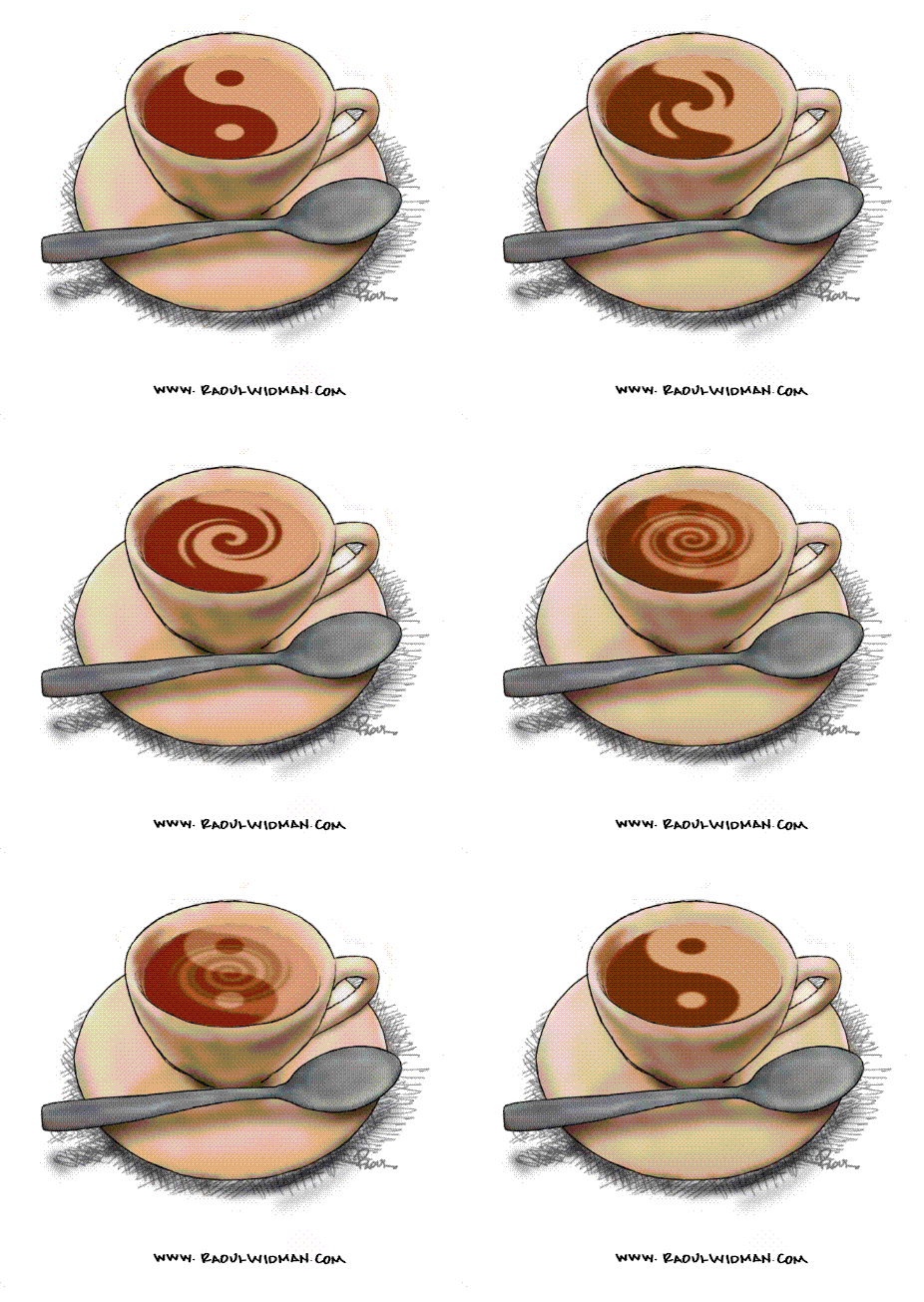
I refined the painting of the cup in ArtRage Studio and did a couple of fast tests to see how it rendered at various sizes.

Looked pretty good so I set to working out a fast way to transform all 42 of the morphing crema transformation images from circles to ellipses in Paint.Net and imported each of them into a layered ArtRage file.

The next step was to export each one of them as a separate GIF to get them ready to animate.

I then moved the set into UnFREEze and tested several frame speeds to get the result I was looking for.

Here you see the Test Version 6.0 in motion.


Karma Macchiato – Day 2

Yesterday I dragged an old project out and dusted it off.   (here)

Looks like this is going to work,  so today I did a couple of things:   1. I didn’t really care for the exact hue of the coffee image so I used Paint.Net to color-shift all 42 images from umber towards sienna.  2. I used Paint.Net to resize the same set from 200×200 to 200×115 pixels, or, from ROUND images to ELLIPSE images.

Then I tested again by making a fast 10-image save of the morph using ArtRage (which plays well with Paint.Net, as both programs can use the Photoshop .psd Format.)

The result?   you decide.

animated GIF of Yin/Yang symbol as espresso

Concept Test 3

Coffee Keeps Life in Balance

I’m working on a new project today.

The Working Title is:  “Karma Macchiato”.

Screen shot of the 1st rough in ArtRage Studio

1st rough in ArtRage Studio

The original idea for this one came about in August of 2008 while I was playing around with some new project ideas.

Coffee is one of my favorite subjects.  I had this black & white Yin/Yang image.  black and white symbol of Yin & YangI imagined painting it as the foamy ‘crema’ atop a cup of a macchiato.  (In Italian “caffe macchiato” means “marked coffee”  – an espresso with just a little marking of steamed milk on top. )
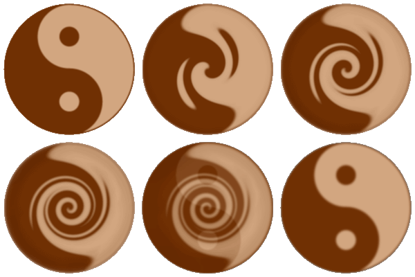
So I’d done a few sketches when it occurred to me that just maybe I could animate it – make it transform, morphing from a crema into the Yin & Yang…

The image below is the origial proof-of-concept test.   This is an image type called a “GIF” – stands for Graphical Interchange Format.

animation: a macchiato crema transforms into Yin and Yang

"Yin/Yang Crema" by Raoul Widman, 2008

I used Paint.Net  to create all of the individual images and then interlaced them with UnFREEze to create the animated GIF.

The project went on the shelf and I decided to haul it out and do it up right.  So that’s what I’m up to today.  When it’s finished I’ll come back and post it here.

WACOM’S NEW “INKLING” just released !

ArtRage Studio Pro

I was doing a massive file-sorting operation here and ran across this fast sketch I made a couple of years ago when I decided to test ArtRage.  I’m posting it just because it’s such a fine example of the depth and contrast you can get out of the platform.

Holy Crap! You ate 56 Chicken Nuggets ?? — No problemo

New York recently made this Dual-Option Siphonic Dual Flush  the official Toilet for all new city construction and for replacements.  Now, these things save a LOT of water, so the reason is obvious.

But it’s this DEMO that has me so amazed.  It’s very – – suggestive.  I mean okay it does impress.  But it’s kinda bizarre when you consider it is representing the most extreme disposal scenarios imaginable by engineers . . . ” You ate

HOW MANY tamales ???!! Scary, man. Doesn’t this imply a sort of superhuman view of New Yorkers as eating competition marathoners?